Designing Seamless Mobile Experiences with This UI Kit
Imagine launching a sleek, professional mobile app in a fraction of the usual time. For designers, entrepreneurs, and developers, the gap between a brilliant idea and a polished product often lies in the tedious, time-consuming process of building every screen from scratch. What if you could bypass the foundational design work and jump straight into customization, focusing your energy on the unique features that set your application apart? This is the promise of a well-crafted UI kit, a toolkit that provides the essential building blocks for a modern digital interface.
More Than Just Screens: A Foundation for Your Brand
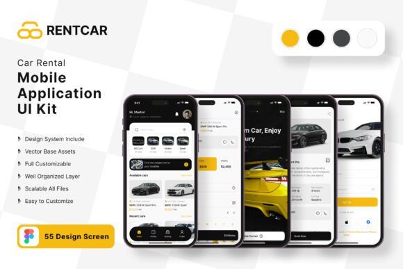
A comprehensive UI kit like the one for car rental applications and AI chat bots is not merely a collection of 55 templates. It's a visual language system. Each of the 80+ UI elements, from buttons and input fields to navigation bars and icons, is designed to work together harmoniously. This consistency is the bedrock of strong brand identity. When a user opens your app, the uniformity in spacing, typography, and interactive elements creates an immediate sense of professionalism and trust. You're not just giving them a tool; you're providing a cohesive experience that reflects the reliability of your service, whether it's booking a vehicle or interacting with an intelligent assistant.
Practical Applications Beyond the App Store
The true value of these design assets extends far beyond a single mobile application. The scalable vectors and fully editable Figma files make these elements perfect for a wide array of creative projects. Consider using them to design:
- Marketing and Launch Materials: Create social media graphics, website banners, and email newsletter templates that visually align with your app's interface, ensuring a seamless brand journey from ad to download.
- Physical and Digital Collateral: Adapt the clean, modern aesthetic for packaging inserts, instruction manuals, or even merchandise like stickers and apparel for your team or early adopters.
- Pitch Decks and Investor Presentations: Use the pixel-perfect screens to demonstrate your app's user flow and functionality in a polished, professional deck that inspires confidence.
- Blog and Editorial Content: Integrate the UI elements into tutorials or case studies on your blog, providing visual context that helps readers understand your product's design philosophy.
The Power of Customization and Figma
A rigid template is a constraint; a flexible one is a launchpad. This kit's strength lies in its adaptability. Because every layer is fully editable in Figma, you can tailor every aspect to your specific brand. Swap out the color palette in minutes to match your corporate guidelines. Adjust the font styles to better reflect your brand's voice—whether that's a friendly sans-serif for approachability or a crisp, modern serif for sophistication. You can add, remove, or rearrange elements on any screen, ensuring the final product isn't just a generic rental app, but your car rental application. This level of control is crucial for creating a unique market presence.
Streamlining the Design-to-Development Workflow
For small teams and solo entrepreneurs, efficiency is everything. Using a pre-built UI kit dramatically accelerates the prototyping phase. Instead of debating the perfect border radius for a button, you can focus on user experience strategy and feature prioritization. The included free icons and fonts remove additional decision points and potential costs, allowing you to allocate resources elsewhere. This practical approach means you can move from concept to a testable prototype in days, not weeks, gathering valuable user feedback much sooner in the process. It’s about working smarter, not just harder, to bring a high-quality product to market.
Making It Uniquely Yours
While the kit provides a robust starting point, the final responsibility for a standout product rests with you. Use the templates as a scaffold. Study the layout patterns for booking flows or chat interfaces, then infuse them with your own unique content and micro-interactions. Test different font pairings from the available styles to find the combination that best communicates your brand's personality. Always preview your designs on actual devices to check for readability and touch-target sizes. The goal is not to use the kit as a final product, but to leverage its professional foundation to build something truly distinctive and effective for your audience. This strategic use of design assets empowers you to compete with a polished, user-centric application from day one.